It was after several weeks of development that we arrived at our final design! We feel the logo stays true to our roots while still reflecting the evolution of CallRevu, and evoking sense of modern structure yet full flexibility. We’re really excited about it and we hope you are too!
If you have been following CallRevu at all this month, you know that we have some pretty exciting things planned for 2019. You may have noticed that we’re just a little excited about it. With the success we’ve achieved in the first ten years of operations, we are looking ahead and planning for the next ten years.
So, why the new look?
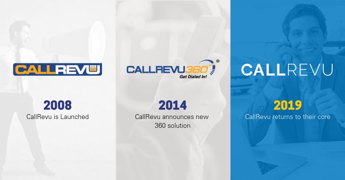
Since our founding in 2008, we’ve more or less stuck with the same branding. But, already in 2019, we’ve changed quite a lot: we’ve now officially introduced CallRevu Dynamic Numbers, Phone Health Alerts, our new CEO, and our new website.
We have taken the feedback from our customers and partners, and our team of developers have been hard at work behind the scenes for many months to bring CallRevu to the next level. With all of these new innovations and products, it was the perfect time to evaluate our company’s brand and logo to ensure it was in sync with who we are and where we’re going. We have re-branded our logo to return to our core, CallRevu.

Our new direction.
As with any logo, we wanted it to concisely convey everything that our company stands for. We wanted to respect where we have come from, and acknowledge the future of communication channels with a hidden chat bubble. Simplicity was key for us while developing a recognizable brand and logo.
It was after several weeks of development that we arrived at our final design! We feel the logo stays true to our roots while still reflecting the evolution of CallRevu, and evoking sense of modern structure yet full flexibility. We’re really excited about it and we hope you are too!


